MULTILINGUAL WAYFINDING
Signage
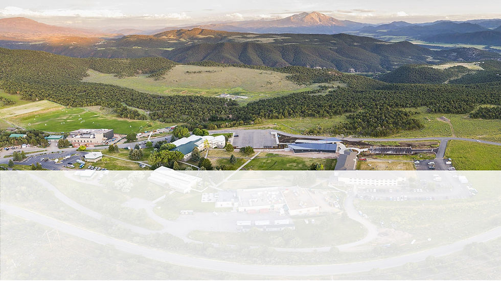
PROJECT 5: Multilingual Wayfinding
I helped design and execute a 300-sign multilingual wayfinding system with my typography class for Colorado Mountain College’s Spring Valley campus. The scope included a complete overhaul of all interior and exterior signage, and every sign was created to be ADA-compliant and bilingual to ensure our diverse Spanish speaking community accessibility and ease of navigation.
This project involved close collaboration with stakeholders and class design teams for consistency throughout all signage. This was a challenge as there were multiple sizes, and we had to create a visual strategy, layout development, and typographic hierarchy. Balancing the needs of readability, campus branding, and spatial clarity was very important.
Beyond technical execution, this project emphasized the power of design and collaboration to create welcoming, inclusive spaces at Colorado Mountain College. By incorporating bilingual messaging and universal symbols, the signage system not only improved wayfinding but also reinforced the college’s commitment to equity and accessibility. It was a meaningful opportunity to apply design thinking at scale, creating a lasting impact for students, staff, and visitors alike.
STRATEGY

RESEARCH
The visual identity of The Tilted Glass combines a dark, moody palette with subtle texture and bold imagery to evoke the sophistication and secrecy of a modern speakeasy.
My typography class spent three weeks researching signage from all over the world. Our main focus was local wayfinding, language hierarchy and visual aesthetics. This helped us to determine the best way to visually showcase the verbiage for each sign.

DESIGN DIRECTION
The homepage features a bold hero container with a captivating image of the bar with sleek typography, immediately immersing users in the mystique of The Tilted Glass.
We explored five different design directions - two column, top down, half and half, pushing the brand and exploring with icons. After meeting with the shareholders we on the two column approach with English on the right and Spanish on the left.

DESIGN EXECUTION
Add paragraph text. Click “Edit Text” to update the font, size and more. To change and reuse text themes, go to Site Styles.
Our class spent most of our time together looking over all V1, V2 and V3 signs to make sure everything looked cohesive and readable. This took up a large chunk of our class time, and it helped us work together to create cohesive signs among different sizes.

GUIDELINE DEVELOPMENT
Add paragraph text. Click “Edit Text” to update the font, size and more. To change and reuse text themes, go to Site Styles.
Our class split up into five teams, and each team focused on streamlining designs and making decisions to keep everything consistent. This will allow a new designer to create signage with clear direction, and it will also be a big time saver in the future.

FINAL DELIVERY
Add paragraph text. Click “Edit Text” to update the font, size and more. To change and reuse text themes, go to Site Styles.
Five team members (including myself) delivered a presentation to the stakeholders with everything we have completed during the semester. It included a PowerPoint presentation and working + delivery files of each sign. We are excited to see them in action at CMC!